Welcome to our new website
You’ll notice that things round here don’t look like they used to. This website has had a comprehensive overhaul: we hope you like what you see. (That stuff from yesterday? April Fool’s. Sorry.)
We are treating this new website as a Beta. There are a few things we won’t be able to move across until this morning, when everything on the server is properly migrated; and we’re sure there are some snags we haven’t spotted. If you find a navigation problem or something that you think is an obvious error, please let us know in the comments below. You’ll notice the nice new friendly URLs for blog posts (/welcome-to-our-new-website/ rather than /archives/6754) but don’t worry – all the old links will still work. And URLs of any pages that aren’t where they used to be should point at their new home. If you spot any 404s let us know in the comments or in the forum.
Everything that you’re used to from our old website is still here: the blog, help pages, forums (which we’ve yet to overhaul and bring in line with the new look – that’s coming in the next couple of months) and Swag Store are all available as usual through the navigation bar you can see at the top of the page. I’m not linking to them here, so you have a reason to start experimenting by clicking around. But there are also some new areas which you might like to spend some time exploring today, and some new ways in which we’re presenting old information.
Teach, Learn, Make
We’re launching a new area of the site for teachers, learners and makers, full of free resources and projects. Teachers will find entire schemes of work, complete with lesson plans, linked to the UK’s new Computing curriculum. Those of you who want to learn on your own will also find materials you can use to find your way around a Raspberry Pi, and what you can do with it; and people who want a step-by-step guide to make their own Raspberry Pi projects will find just what they’re looking for.
All of our materials are Creative Commons licensed. The licence we use is CC BY-SA (attribution and share-alike), which is the licence used by Wikipedia.
![]()
We welcome your contributions to our materials. What you see here today is only the start: we will be adding more materials very regularly in all three categories: Teach, Learn and Make. Keep checking back; we’ll also flag up on this blog and on Twitter whenever new resources are available.
Documentation
We have made a big change to the way we deal with documentation. A bit of background is necessary here. Until now, we’ve relied on the third-party, crowd-sourced wiki at eLinux. This was set up in 2012 when we had absolutely no staff, and we asked the community to help populate it, because we didn’t have the resources ourselves. We at the Foundation have no oversight over that wiki, and we’ve noticed that it’s become a bit out of date.
So we’ve taken the decision to move all of our documentation in-house, but we’ve done so in a way that means that you can make additions and alterations if you think we’ve missed something – with our oversight. All of our documentation is written in Markdown, and lives on GitHub. It’s not an open wiki, but if you want to make a change, please open an issue on GitHub. (Learn more here.) We’ll consider all issues which are opened, and if we accept yours, you can file a pull request with your change. It’s a way to keep things lean, consistent and accurate. Everything gets looked over by the team of people who make the Raspberry Pi to be checked for accuracy: at the same time, it allows you to pull us up on anything you think we should expand on.
Some of what we have here now is based around a kernel of documentation from the old eLinux wiki, and we are very, very grateful to everyone who contributed materials to it that we have been able to use here. The new documentation also covers all the stuff we used to host here separately: datasheets, hardware specs and so on. We’ve still got some editorial work to do on some of what we’ve pulled in to the new documentation, but it should be usable from today.
Thanks
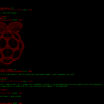
I’d like to thank the education and web folks here at Pi Towers, especially Carrie Anne Philbin, who has written more top-quality resources in the last two months than we thought it was possible for one human being to produce, all while running workshops and organising Picademy; and Ben Nuttall, who has been stumbling around the office muttering and tugging at his hair for the last fortnight, sent three-quarters mad by a mixture of insufficient sleep, ignorant requests from his boss (me) and too much staring at a terminal window. His wild eyes and trembling lip are making me feel guilty, and I have been worried that he might die of overwork or run away and retrain as a sponge diver before we got everything finished. (I think you’ll agree that he’s done a simply amazing job in a very short time. Most of what you see here is down to Ben; despite appearances to the contrary, he’s a bundle of joy, and we’re very lucky to have him on the team.)

This is what not enough sleep and too much coffee looks like.
Thanks to Laura for the exceptionally smooth and painless editorial ride she’s given us. Thanks to Dave and Clive for the resources and the cakes; thanks to Lance for his oversight (we couldn’t manage without you, Lance); thanks to Emma for keeping us all in line; thanks to Rachel for the photos; thanks to the team at Du.st for the design work – and no thanks at all to Gordon, who ate all our jelly babies, drank most of the coffee and laughed at us when we asked him what hdmi_ignore_edid=0xa5000080 does.
We hope you like what you see. As for me and the team, we’re going to go and sit very quietly on a lawn somewhere, read the newspaper and drink tea for the rest of the day.


158 comments
Tnw513
It’s awesome :)
Nicolas
It’s wonderful !
Michael Horne
Congratulations guys, seriously, it’s better-looking and more content-rich than I think any of us were expecting. Now get that Ben some sleep – he looks like he needs it!
James
I love it! The design is a big improvement from the other one, and a massive improvement from yesterday. I hope it stays this way.
Pirtom Lubis
Beautiful. Love the Resources part.
Craig Richardson
The new site looks lovely. Well done to everyone on the Raspberry Pi team!
One thing, the lessons plans for Google Coder are showing a 404 page http://www.raspberrypi.org/Lesson-1/lesson-plan-1.md
Liz Upton
Thanks Craig. We’ve got to correct some addresses manually in GitHub to fix that – it’s on the bugfix list.
Sander
I love the new look!
But also a remark: I find the fixed-width font rather uncomfortable to read.
Richard Mitchell
Love it, great design and content. You had me worried for a moment yesterday!
Jose
Hey guys, you have changed the forum link!! That means that comming from Google, all pages are 404, even if the forum is still the same.
Please implement a redirect (or simply continue using /forum) soon or you will loose all the pagerank for the forum threats :(
Dave Akerman
This is awful – what happened to that much better green and red version from yesterday? Thsnks to you I no longer have any use for my 300 baud modem.
Angered of Herefordshire
Dave Akerman
p.s. Great stuff and congrats to all those involved. Now take a break (from work and caffeine!)
Dave
Ben
It’s nice, polished and effective.
Thanks folks, keep up this good work !
Stewart Watkiss
Wow – looks great! Very professional and great new resources section.
Now we know why it’s taken so long to put together, looks like it was well worth the wait.
Saurabh
Some links have issues for eg – http://www.raspberrypi.org/Lesson-2/lesson-plan-2.md
Saurabh
Ah damn, didn’t see someone had already spotted it!
John Anderson
I like this, seems lively and simply organized. Now if I could just get off my but and work on my RPi project…
LKO
Yes, where is the simple beauty that was here yesterday? Green text only for a low-bandwidth win! Sigh….
Jim Green
FYI the forums link above is failing with too many redirects.
Jose
Yeah, seems that they are now trying to fix the forum links with an Apache redirect. I hope that they will solve the problem soon as now no-one can access any forum link at all…
Steven Bratton
A great showcase for all of the work that you guys do. Very quick and easy to navigate and I found new content I’d not seen before. Good work.
Dan
The current forums link has a redirect loop. The current link is “http://www.raspberrypi.org/forumsssssssssssssssssssssssssssssssssssssssssss/”, Have I caught it during a debugging time?
Liz Upton
Do you know, I think you might have. :D
Ravenous
Well done everyone (whoever they were) behind the re-done Documentation bits. Should fend off at least some of the “how do I get started” posts!
Liz Upton
We’ve still got some work to do on them (and it’s a big job: there’s a LOT of data there); and I really hope they help. If you do see any problems, we’d really appreciate issues being opened on GitHub.
Paddy
Wow. It’s great. Nice and easy to navigate, great retro feel, loads of learning resource.
The black and red site yesterday was great fun, but I’d have gone blind if you had stuck with that.
Well done team – you deserve a day off.
Liz Upton
We’re already on the buxfixing treadmill, I’m afraid – but I have a feeling we might be taking things quite easy on Friday.
Niall
I suggest a day off for the Towers Team – GoKarts and Bowling – followed by Pizza and Beer (please, do NOT consider rearranging that schedule !!).
I’m going to muss that Viewdata/Prestel/Teletext look and feel, and that pleasant warbling tone as my old dial-up modem hooked itself onto the t’interweb.
Can we have the green and red website kept for high days and holidays? *Even better if you can also get the clickety-clack chatter of a true telex machine to run in time with the characters as they appear on screen . . .)
Wel done to the Team – now I’m off to see what’s hiding behind all those buttons (and to read that crazy number of comments from yesterday’s update!!).
Cheers,
Niall
pete
Thank godness it’s MUCH better than the old site …. Not easy to get these sort of things right (new bbc iplayer springs to mind) … but it’s spot on! … and has room to grow! Well done!!!!
Nick
Congratulations to Ben and the rest of the team for a more educational looking website. Job well done.
I’m pleasantly surprised by the change. It is more informative and better to read then the original.
Keep up the great work!
Greetings from the Netherlands.
bertwert
This is great!
Where is the option for yesterday’s site?
PS
Would this be why the website was down last night?
bertwert
NO TIPS OF THE DAY!?!?
Nic
That’s much tidier, thanks.
You could perhaps increase the contrast between the body text and the background just a tad. Same for the comments. It’s quite clear, but it just feels tiring to read the longer pieces of text like the blog. It’s not as noticeable with shorter sections of text like on the homepage.
TheMainMan
I have to agree with the critique about the font. I find it quite tiring to read compared with the old font. For me it’s partly due to spacing and partly due to the short serifs.
Layout is great and I love the splashes of colour!
winkleink
Well done. Loving the Resources section.
A strange one the font is harder to read in Chrome 33 than in IE8
Specs:
Lenovo X1 Carbon
Windows 7
Link to Google Drive for screen grabs.
Both with zoom set to 100%.
No idea why.
winkleink
Sorry missed off the link to Screen captures.
https://drive.google.com/folderview?id=0B23BvTk93HRYRnlPWG9MbGM5aGc&usp=sharing
Josh
All text looks a bit different in Chrome to in IE. Apparently Chrome will soon join IE and Firefox in adopting the superior DirectWrite renderer, which I guess would fix this.
winkleink
When Posting the Reply I got the following error
“An internal server error occurred. Please try again later.”
Reply was submitted as when I did a refresh I got the message about the duplicate comment.
May just be volume.
Chi
Hi Friends,
Congratulations for the wonderful new website!
Go and have a well deserved break and lots of cakes. :-)
Is this done using WordPress platform?
monkathon
I feel guilty for saying this, but I don’t like the new design as it is now. The general theme is nice enough but a few things jump out at me as things that could be improved.
1) Raspberry Pi branding is too scarce. Aside from the little logo in the header, there’s nothing much on the page (at least on mainly text blog articles) that tells you what site you’re on. I think the logo-to-navigation screen area ratio could be tweaked in the logo’s favour, and maybe teh words Raspberry Pi added to it.
2) A new site theme in 2014 that’s not responsive? Sacrebleu! No more fixed page widths, please! We have screens of all different sizes now.
3) The main body font, Roboto Slab, is not as easy on the eye for scanning large pieces of text compared to something like Open Sans or even plain Roboto. I think Roboto Slab is better suited to headings, although this point is very subjective!
I like the direction it’s going in though! :)
Rhys Streefland
The new site is very difficult to browse on my phone because it is not responsive. The header does not behave properly on my phone either.
Great new site, but I often like to browse it on the go so this is a bit of a pain for me.
Jim Manley
What is this garish whiteness behind the spindly little stalks posing as some sort of scratchy rune of yore?!?!? Seriously, the subdued blackness of yesterday was a great relief as I’ve recently taken to using 27-inch Viewsonic 1080p and Westinghouse 50-inch 1080p displays for my primary Pi output. Having a pure white background is extremely fatiguing and I would strongly suggest taking it down to no more than a 70% beige/gray/vellum shade. The typeface (font is not the correct term, that only identifies the family, not the size, attributes, etc.) is great being a serifed monospace, but it needs some help in being fattened up a bit in the vertical strokes. The curiously way-too-large line spacing, along with the overly-white background, leads to early eyeball fatigue. More comments as I peruse the remainder, but other than those immediate nits, it’s looking pretty, pretty good, as that nebbisher Larry David would say!
Jim Manley
Now that I’m not rushing off to work at 7:30 AM (local), I’ve been able to spend some quality time with the site and need to clarify my post above, first. My comment about the spindly typeface was primarily meant for the comments, although the line spacing is still a big issue in the original post text area – it needs to be reduced by at least 30%, maybe even 50%. It makes scrolling even more of a chore than it already is.
I would love to be able to collapse/expand all of the comments to show just the poster’s name, date, and first line of the comment to make scrolling down to where we last read that much faster. If a cookie is allowed, you could even store the comment number to which we had last scrolled and return us there, even after a page reload to pull in newer comments. Speaking of comment numbers … where’d they go? Binary was a bit inconvenient, but using the background color for the comment number text is not a great idea : D
The width of the post should be just a bit smaller than whatever the reader’s device and browsing software can support. It’s ridiculous to ignore all of the technology at our disposal and try to force a particular editorially-mandated width (and other formattting, for that matter) on everyone – you’re not printing to paper any more, so please stop acting like you are! Sorry, I’m really aiming this particular barb at whomever it is who’s telling website designers that they must control every aspect of their output, readers be damned. We software engineers didn’t provide you this power to be abused so routinely and we will take it away if you persist in this nonsense! If you want to provide multiple themes/style-sheet options so that the editors can have their way in their own little sandbox, that would be great so that the rest of us with common sense can get on with the business at hand, and that’s being informed as quickly and painlessly as possible (assuming you don’t own stock in Visine or other manufacturers of similar eye-relief products).
Where’s the emoticon palette in the comment editor? Now everyone is going to think I’m a nasty old fart of a curmudgeon who’s fallen out of touch with what the kids think is hip who need to get off my lawn … well, OK, that does describe me to a tee, but now I have no way to at least try to modulate my misperceived casting of stones in all directions (hint: I’m qualified Expert on the M-16 and .45 caliber pistol, and with a laser rangefinder or target designator … well, can you spell “dead meat”? I can be pretty selective with said stones, too). Did the emoticons suddenly become punctuation non grata – first they disappeared from the April Fools format (or, more accurately, their raw text representations were suppressed, as usual, by WordPress) and now even the comic strip icons have been banished. Were they demanding excessive wages, especially if they wanted to be paid in “beer not as in free”, and particularly during working hours? ; )
Thank you, thank you, thank you for taking blog posts off the home page so that our Pii can finally load the home page in Midori on a 256 MB model without having to alter the space-time continuum in order to see the page load within our lifetimes.
Jim Manley
I accidentally posted the previous comment, but it was already upper 99.999th percentile obese ; )
OK, this one I consider egregious and I made it perfectly clear what should be done in person, albeit as a polite dinner guest … on a harried quest … in the rain … at night … to downtown San Francisco … with a six-block walk each way … did I mention that was in the rain, too? : D THE HOME PAGE CANNOT LOAD ON A 256 MB PI WITHIN A NORMAL HUMAN LIFESPAN (whatever NORMAL is). I’m not yelling, it’s just a lonnnnnng way to Pi Towers from here and it’s late at night there. I’m predicting that the same is true for many, if not most, other pages. You need to have the server do a platform/browser detect on the incoming HTTP request and only send an appropriate amount of data or risk choking the poor little Pi that was only doing what it was told to do. WE NEED THIS FOR JAMS, OTHER PUBLIC DEMOS, AND SCHOOL USE.If you need to drop down to a derivative of the April Fools Day Massacre style sheet (but with a slightly less insane choice of colors), that’s fine, just give us the ability to selectively click on images to get them to download in that case (otherwise, we can just use lynx, but that’s a bit too barbarian). Yes, I could rig up some Rube Goldberg proxy server that does the striptease on the bulk, but why not just do it there? It’s not like Ben has anything left to do now, right? HA-HA-HA-HA-HA!!! Like ALF, I kill me! : D Please, please, please fix this ASAP – my next Jam is on April 19th, BTW, and a new Jam series in yet-another location will be starting the following Saturday, the 26th.
Liz Upton
I think we know what’s causing that – unlikely to get a fix in today, though, ‘cos we’re pooped.
Sven
I just found a minor bug with the new menu bar: when you open the search bar and mouse over Resources, Teach is covered with the search bar. Here is a screenshot evidence, but it is also easy to try out yourself.
bertwert
Press search again to minimize the search bar ;-)
Ozzy Walsh(ozzyofpi
New website looks cool! Did you get inspired by Pimoroni’s website.
PaulDow
I like the layout, but I think it needs more contrast. The dark grey text over light grey isn’t too easy for me to read. Grey seems to be the web color trend this year. Of course it’s easier to adjust than the avocado green or harvest gold appliances that were bought many years ago.
I’d suggest making the logo in full color instead of the white line outline too.
I also do like the colors on the sub-menu. It’s like pulling out the sample cards at the paint store.
Tomsk31
New look is fab – resources page is great.
Small thing – Lesson links on Turning Test Lessons page (http://www.raspberrypi.org/learning/turing-test-lessons/) give 404. I think there’s a stray ‘/’ in the urls.
bertwert
That is now fixed…
But these that come from the page aren’t
http://www.raspberrypi.org/teacher-instructions.md
http://www.raspberrypi.org/Lesson-1/lesson-plan-1.md
http://www.raspberrypi.org/Lesson-2/lesson-plan-2.md
http://www.raspberrypi.org/Lesson-3/lesson-plan-3.md
Digiduck
Hi,
love the new website. nice add the resources part.
i really enjoy browsing around.
Andy Crofts
Oh, WOW!!!!
What a makeover! Clear, and love the homepage.
To the nay-sayers, did you read the bit about “Beta??”.
Yeps, for this 57-year-old Pi tinkerer, it’s a tad…er…’Sudden’…but think of the target audience of the Raspberry Pi. Perfect, simple, bright. The opening page is an inspiration.
Love the idea of organising the documentation in-house, Git can be a bit foreboding if you’re in late Primary school, or using Git to ‘clone’ (only command I know!) stuff once a month.
8/10. At minimum. Reckon it’ll get min. 9/10 when it’s not beta.
Lovely job, and congratulations to all.
-Andy, Oulu, Finland.
(Liz – you weren’t serious about tea to celebrate? NAH!)
bernd71
I also find it harder to read because of the lower contrast and used font. I’m not sure if I like the new design, maybe it will take some time.
Andy Crofts
Seems like just ‘up’ the contrast is first step. I’d agree with that, I’ve seen enough websites whre they think it’s Kewl an l33t to do dark grey on black.
Or dark grey on green. Sigh.
Don’t those muppets know that ‘Kewl’ and ‘l33t’ belong to The Matrix. Belongs soo much to “the ‘naughties’ (2000-2009)”.
Oh, and the character set. If I hit space bar, I’m not quite sure if I’ve had a ‘fit of the vapours’ and my beer-induced shaking has caused me to hit it twice…
nessu
Would there be a possibility to use the old design of the website also for the newer news by using a ww.raspberrypi.org link or something like that?
I would like to have this option for using the website with a kindle (etc.) Thanks for the answers !!!
Kemp
I like the new design overall, but there are two improvements I can suggest:
1) More obvious Pi branding – currently this could be any random company’s site.
2) A different font. I have to force my brain to process blocks of text in this one. It’s almost impossible to scan read.
Michael
Hi, On my Nexus 7 (original) the header bar ends with the blue RESOURCES tab on Firefox and with the search link on Chrome, The Swag shop link is therefore invisible on both. I can’t resize or scroll to see the right-hand side either.
The Nexus has a 1280 x 800 screen which should be wide enough, maybe you need to narrow the tabs a tiny bit to fit in that (common) width.
Otherwise congratulations on an elegant update. (I’m just home from listening to Eben speak in UCD in Dublin.)
Trevor
Somebody get Ben a second monitor! No wonder his eyes look so strained, doing web development on just the one screen. ;)
Site is looking awesome, very sharp and clean. Love it!
Ozzy Walsh(ozzyofpi)
The scream mp3 link for the guide to making a jelly baby scream doesn’t seem to be working.
pd
Uhmmm, maybe it’s my setup (Firefox 30.0a2 (2014-04-02)) but webdesign 101: no horizontal scrolling. This new design seems to fail that test.
Trevor
I think it’s just you – I have no problems in Chrome 35.0.1905.3 (dev channel Chromebook), Firefox 28.0 (Ubuntu 12.04), or Android versions of the same (Nexus 4).
Just to be thorough, I pulled it up in my IE6 VM. Only a very minor cutoff of the overhead bars on that ancient browser, it rolls over to a second line instead of getting wider. Other than that, though, no problems with scaling across quite a wide spread of resolutions and browsers (though I’d like to second Michael’s comment about the store button being inaccessible to Android browsers).
Anonymous
Getting a horizontal scroll bar, too.
Firefox 28.0 on Kubuntu 13.10, screen size 1024 x 600 (netbook), Firefox window maximized for testing (F11).
Decreasing zoom level/font size once (Ctrl + -) helps.
Ozzy Walsh(ozzyofpi)
Sorry about that, the link is working.
It was just a connection problem on my Pi.
bertwert
Lesson 1 – Websites & Webservers
Lesson 2 – What is HTML?
Lesson 3 – Adding Images and Other Media
Lesson 4 – Adding Style with CSS
Lesson 5 – Colour with CSS
Lesson 6 – Evaluation
In the HTML and CSS Learn under Resources links are dead
Jeffrey Dill
The new site is absolutely fantastic.
The only suggestion I’d make, and this may just be my personal preference, is to have any links that take you to an external site be opened in a new tab/window instead of in the current tab/window. That way visitors always stay engaged with your site and don’t have to navigate back to where they were before they were taken to an external site.
GREAT JOB!
Ben Nuttall
No. This is bad practice. If all links open in the same tab, you have a choice (middle click / right click lets you open in new tab) whereas if we force a new tab there’s no way you can choose for yourself.
tzj
As its treated as beta i’ll be leanient on you guys regarding use of the site on mobiles.
Just a couple notes… the page optimised for desktop only atm so zooming in merges the text on the blog page. The menu bar could be on tabs on the side or scrollable?
To be fair an app would probably be a better idea.
Rick
Glad to finally see the redesign. To echo a couple of points above with some hopefully constructive criticism:
– Fonts. The whole Courier Monospace feel is a bot over the top IMO. It feels like you’re trying too hard to make the site trendy and hip (I hate those words so much)…that probably makes no sense whatsoever.
– Branding. That tiny little Pi logo is easy to miss and make the site feel like it’s running a generic layout from somewhere like Themeforest.
– Speed. Yeah this is probably just a temporary thing whilst we all oogle over the new site. The site seems pretty sluggish at the moment.
Going back to the fonts – at very least something needs to be done with comment fonts. I’ve got 3 screens that I use for dev work. One of them is high contrast, one of them is my rMBP (calibrated to ‘normal’) and the other is low contrast.
On the high and low contrast screens the comment text is extremely hard to read. I have it on this setting as most home users have cheap screens that haven’t been calibrated, so when it comes to design work I tend to test contrasts out on all multiple types.
Hope this helps :)
Rick
I cant believe I missed this but…well…you kind of don’t expect such a crazy thing.
Why on earth is the site not responsive? I mean, there’s no excuse at all for that in this day and age :/
I don’t want to sound mean…it’s just…well…really?! Really hope this is something you’ve got on the todo list.
Matthew
It’s, it’s…. *pause to think of a word* …. Beautiful!!
Well done all =D
smartroad
Sorry to be the nah-sayer but I don’t like this new theme :(
The old one was uniquely Raspberry Pi with its distinct red and white theme. I never found it that hard to navigate round for the most part.
This site looks, well, generic. The logos are small and indistinct and the monospaced font are really hard to read anyway and, I think, worse for Dyslexics (at least I have been told at the school I work at to not use serif and monospaced fonts).
It is clean though and nice to look at (aside from the font), it just doesn’t scream Raspberry Pi like the last one did.
I’ll get my coat now, sorry :(
JBeale
Overall look is good, congrats. I see on http://www.raspberrypi.org/community/ you have a link to “PI PROJECTS – repository from Dr Andrew Robinson” but that site appears to be empty, except for a video about tapirs and some buttons that go nowhere.
Eric
Please check the
NoReverseMatch at /learn/
Reverse for ‘form’ with arguments ‘()’ and keyword arguments ‘{}’ not found.
at the link
http://www.raspberry-pi-projects.org.uk/learn/
Matthew
Noticed that as well
hiro
Nice colourful new design, i really like it. As mentioned by a few others the text colour is a little too light for my eyes making it hard to read. Would it be possible to darken it a few shades?
bluecar1
must say, not a fan of the “new” front page, but the downloads,community,help, forums and resources are much better
having to scroll across is not good, you are not sure what the current article is
Bantammenace
Sorry, but I find the new website text harder to read, particularly anything in red such as Reply, Comments.
It will also likely drink ink when I print stuff off.
Is there a way to lose the mocha background and leave it white ?
My screen resolution is 1680×1050
I am happy that Education aspect is getting a higher profile.
Pygar2
I hope that the text, like this, can be made darker. Or thicker or *something*. It’s sized nicely but hard to read. I like the overall look, but if these aged eyes can’t read it easier then I won’t enjoy the content as much…
IrishFramboise (AlanMc)
Merci.
Daniel O’Brien (@DanielObrien42)
Buy Ben a monitor to go with that keyboard and mouse on his itty-bitty laptop.
pbock25
Nice work! Looks good and is very friendly. I’m so happy that yesterday’s was a joke.
Matthew
404 error- link from the Turing test to the teacher setup instructions doesn’t work
PS- I am loving the 404 page =D
Popfizz
I love the new look but I loved the old look better.
By the old look I meant the Binary april fools joke and the original.
ameyring
It’s a beautiful site, but had some trouble viewing with on a smart phone due to the wide format. The previous site (pre-April Fools) worked better. Hope you can improve it for better mobile use.
Ian Bardsley
+1 on the text colour being a little too light for my old eyes. Otherwise great work on the format
Mark A. Greenwood
The new site looks great.
You asked for things that were missing though; any chance of adding the link element to /blog pointing at the RSS feed at /blog/feed, for news aggregators that check the HTML page to find the feed?
Mitch
Oh man, this is gorgeous! Seriously nice! I love it!! The site has been needing an update for a while now, I’m glad you were able to make it look SO nice! Way to go Ben, being a programmer myself, I feel ya!
neil howson
Looks great on a fast connection on the desktop but takes ages to load and is virtually unreadable on a gprs connected mobile (galaxy s3)
Are there any plans for a mobile optimised version?
Liz Upton
Yes, there are; hopefully to be released next week.
Nico
Congrats on a very functional website.
In South Africa we are the victims of slow, expensive internet services.
Many (like me) rather use 3G at home, as ADSL is too expensive :(
I experience the new web site quite slow to load – eg – it took more than 60 seconds to load the “Blogs” section on the home page.
Keep up the good work!
Nico
Eric Olson
The new website displays fine on my office desktop in either Iceweasel or Chromium browser on Debian Wheezy. However for Chrome on a Nexus4 smart phone the site displays poorly. If you zoom in, the menus bar at the top is only partially displayed and cannot be used while the menus at the left are displayed on top of the text making it difficult to read.
Being viewable on a smartphone is important because while on the train or bus is when many adults have time to read. Also kids have phones.
Of course the most important thing is for the website to display quickly on the Raspberry Pi. Along these lines, it would makes sense to avoid animations and bandwidth heavy graphics on the main page. In an educational setting it is not unusual to have many Raspberry Pi computers connected to a low bandwidth upstream link. It is awkward if the link gets overloaded in the first two minutes of class.
Piero
Great work! Simply beautiful and very useful!
Thanks :-)
Ian
I’ve been following this website since the very begining, some good points and serious bad points
Good,
1)colour scheme/ menu and fonts
2)Top menu
Bad
1) looks seriously bad on my mobile (galaxy s3)
2) size of the web page to download and the reponse is truely aweful, to the degree I thought there was a problem on my end – please reduce the size at least the front page
3) logo thing (mentioned previously)
4) the front page should be snappy and striaght to the point with latest news – if you must have rotating pictures – please reduce the size!!!
Netural
1) fonts, ok but could be better
Liz Upton
Mobile’s coming later – probably some time next week. (I think that making Ben come in and furtle up the scheme today would be both cruel and unusual.)
Michael
Hi Liz
Mobile versions of sites are necessary for phones but one of the pleasures of a tablet with decent resolution is that you can view the normal desktop version of sites and just expand when you find what you want. An example is the Wikipedia Android app where almost everything is hidden and has to be clicked to view. It would be nice therefore if your new site could take this into account. As well as being too wide for the 1280×800 display on my Nexus 7, when I zoom the screen the already quite large blocks in the header begin to take up a significant amount of the screen while adding less and less since only the left-hand ones can be seen.
Another problem when zooming on the main blog page is that while the red index headings on the right zoom as well, they don’t scroll out of the way when I scroll the text to view it at full width.
These are all intended as constructive criticism and I hope that many things can be fixed by tweaks to the stylesheet rather than by keeping Ben chained to that tiny laptop!
Liz Upton
We do have a mobile theme in the works – it’s coming next week, all being well. (And if Ben is doing as he’s told, he should be asleep at the moment!)
Stewart Watkiss
Just like to add that the new site made it much easier for me yesterday. I was at a STEMNet meeting talking with some teachers about using the Raspberry Pi in schools. Previously I would have needed to provide several different websites for the teachers to go to (writing on scraps of paper) instead I found myself saying “look at the new Raspberry Pi website it’s on/linked from there”.
For example:
I was talking to one teacher about the MagPi magazine that they’d heard of bit didn’t know where to find it. They didn’t need to remember the name of the magazine I just said “There’s a link from the Raspberry Pi website”.
Another teacher was asking about the benefits of using the Raspberry Pi over their existing PCs. We got talking about physical computing and I said “Look at the Jelly Baby project on the Raspberry Pi website”.
I also think the HELP section is great. The eLinux Wiki was good at the time and I expect will continue to be useful for some people, but it’s only really suitable for the more technical users (as was the case with many of the early adopters). The Help section is going to be much more useful for new users of the Raspberry Pi.
I see there are some pages that are still fairly empty. I’ve seen the comment about contributing and I’ll have a go at putting something together for some of the empty sections, although I’ve still got a long list of things I want to do on the Raspberry Pi as well (a list that keeps getting longer when I get new ideas).
A small suggestion for improvement – how about adding some “title=” tags onto the icons at the bottom. Whilst the Twitter and g+ logos are fairly obvious it’s no so easy with the other icons. What the difference is between ‘binary cat’ and ‘alphabet cat’? Answer: Raspberry Pi GitHub (documentation and software) vs GitHub learning resources (teaching / how to guides).
b1ackmai1er
Sorry, I really dislike the top menu bar and the new font.
The top menu colours are all “girly” colours without any bright, bold, clean boy colours. I think it is only fair to have a mix to cater for boys and girls.
Also. There is so much spare space on the LHS and RHS, can this not be use for menu’s rather than taking up content space.
The new font is very clean but very hard to read, especially when switching between web pages and it is way to large.
Why is the Raspberry black?
I really like this site layout: https://www.ozbargain.com.au/ and find it very the layout concentrated a lot of information into the whole page but is very easy for the eyes to navigate.
Love all the other work you do but prefer the old site.
Liz Upton
Girly colours? Boy colours?
Wut?
u8nc
This comment is not for public consumption, move along folks nothing to see here. I want to see if the comments are able to be edited ( even if limited to a short time lapse ) . Times there were when entering comments on a tablet and, ooops-, I touched the [ Post Comment ] button before i wanted to.
I’m also interested in seeing what mischief i can create by hmmmmmmmmmmmmmmmmmmmmmmmmmmmmmmmmmmmmmmmmmm that artefact that appeared about 20 comments down from the top
at least the monospace font allows me to do things like:
_!_
*—-[.(o).]—-*
__ | __
<———->
\ /
-+-oO–{^}–Oo-+-
Bombs away!
chorlton2080
Err… certainly not as good on a mobile screen than the old version and I have the large screen benefits of a Galaxy Note 2.
Can you provide a mobile optimised version? Or a more promised version of that is in fact what I’m receiving now on my device?
Ben Nuttall
Yes, as we’ve clarified many times, a responsive layout is in development. It’s not been neglected.
Ian
The more I look around the more I like it,
very small thing..
Should the option “Blog” not be News?
Blog to me, means a diary or ramblings
it’s more of news that was on the front page
ghp
Hello, looks great, but not on my smartphone I use in train to get latest news. The menus are not available on mobile, and these lot of pictures are not loading ‘in time’ when you have limited connection.
The font, as stated before, are not good to read.
You get 5 points for ‘good looking’, but 4 points reduced for usability.
Regards, Gerhard
ian
Why do I need to allow ajax.googleapis.com jscipt to run?
I suspect I know the answer but why??
Ben Nuttall
Erm. The site uses jQuery. Like most of the web today.
The site works basically fine without JS, if you’re really that offended by client-side scripts.
Ian
Hi Ben,
the site looks crazy with out jscipt permissions for ajax.googleapis.com (using firefox 28)
My question not really aimed just at you guys, but why do people use a 3rd party (ie google in this case) ajax/jscript libraries – genuine question
Ben Nuttall
It’s quite common practice. If many sites use Google’s hosted jQuery source then it’s cached for the user and will decrease latency in loading a page. See http://encosia.com/3-reasons-why-you-should-let-google-host-jquery-for-you/
Admittedly the home page is visually less than ideal when viewed with JS disabled (I can fix this, will do in time) but generally the site doesn’t depend on it too much.
Ian
Thanks – very interesting
I’ve always been paranoid about web sites using 3rd party plug-in’s since they can also be used to track usage with you (admittedly good for you guys) but it also allows google to profile peoples internet usage
Bill Smith
Great-looking site. Congratulations to all involved.
Paul
I find the new font you are using very hard to read, even on my 27 inch monitor it is very unpleasant for my eyes. I have spent a lot of time reading about great stuff here, visited the site almost every day. But with this new font all pleasure is gone.
Steve gale
New web site is fantastic on my iPad , just spent an hour looking at everything , congrats to all involved
Michael
Hi
Just wondering where all the links for your friends like Pimoroni etc have gone? Is this an oversight or a policy decision?
Matt Brown
Looks great – you guys now have the website you deserve.
Only one oddity – the Uptons have been left out of the about page Hall of Fame. Shome mishtake shurely?
Liz Upton
Felt a bit awkward – we’re plastered all over the blog, and we don’t call out the other people in the office there, so I’ve left us off for now.
Gerhard Hepp
Hello, I tried to use the website with midori on RaspberryPi.
Hmm, the previous blog style layout is much more response. Scrolling down takes quite a lot of CPU and is not very smooth.
Regards
Gerhard
Bob
Nice website!! But I also find the ‘grey on grey’ text tiring to read.
wombat
Bring back Tuesdays retro look!
John-Paul
I like the overall look, not sure about the black outlined section topics though.
I think the main banner should be shorter so that the blog section can be seen in it entirety when the page loads, right now it is cut off.
Finally, the main reason I visit daily is to see the most recent blog post, but I am not sure what that is with the sliding blog links.
I am using Firefox with a 1280 x 1024 screen resolution.
AndrewS
You could simply change your daily visit to view http://www.raspberrypi.org/blog/ instead of http://www.raspberrypi.org/ ?
Liz Upton
We’re noticing some Firefox bugs – that banner cutoff thing you mention is one of them. It’s not right at the top of the fix list at the minute, but we’ll get to it eventually.
Michael Horne
Been using the new site for a little while now and have just read the previous comments just to check something.
The font and the colours do make my eyes very tired… I know it’s not a big thing, but the new font and colours aren’t good for those with visual impairment.
I’d like to see the full-colour Pi logo back, although the black is very stylish.
I still very much like the new site though :-)
Jeff (fos)
I guess it is meant to engage school children. If that is the case, it is OK.
Personally, with my low vision, I don’t like the movement. It is hard to follow.
Jeff
Czuhc
Hello, just wanted to let you know that I get an error 404 when clicking the lesson links in http://www.raspberrypi.org/learning/turing-test-lessons/
Martyn Jones
I’ve completely updated my Pi with sudo apt-get update, upgrade and rpi-update etc and gone to the new website using the default Midori browser only to find that the videos don’t play due to not having Flash or an HTML5 compatible browser.
So which is the recommended browser to view the Raspberry Pi’s own website please?
Liz Upton
We’re currently working on a super-optimised version of Epiphany (also called Web by some developers, but we’ve reverted to Epiphany because a web browser called Web is confusing). Watch this space.
captainwebb
I hate it. Way too much white (well, dingy grey) space, font too light, in colour and weight. Information density per screen at the “duh” level.
It’s the “Janet and John” look – “see Pi run”.
Can we hope for a version for literate people?
Ben Nuttall
How’s http://www.raspberrypi.org/blog/?fool – any better?
Liz Upton
*High-five*
andycrofts
Peculiar comment…
“Can we hope for a version for literate people?”
Erm, we seem to forget the target audience of the Pi. Youngsters who will simply love this clean, clear site.
As an old git (not Git..) I have spent an afternoon thoroughly enjoying stuff I read – learnt so much more.
Ok one suggestion. Can a style-sheet be created for clear printing from the resources tab? Bit like Adafruit does with their ‘download PDF’ thingy?
Bit less ink, easier to read. Personally, I prefer ‘dead tree’ format for reading on the bus..
Liz Upton
Yes, we’re in the process of doing that – we all agree that for teaching, printouts are the way to go. (Still waiting on some design assets for the printed versions, which is what’s going on with the holdup.) I hope we’ll have something in place in the next couple of weeks.
Jo
So you guys say this a beta but then whenever anyone makes a suggestion or criticism you put them down and then slap each others backs? The guy may not have put it very well (yes, he was rude) but that doesn’t mean he does not have something useful to say. Reading thru the comments, you only seem to reply to poke fun or to be defensive, but you don’t actually answer the communities comments.
I don’t know if you think the site is perfect or if you are being defensive(these comments aren’t personal you know, they are people telling you what they really think) but as a long term Raspberry Pi user I find it kinda sad that you are treating your community this way. Feel free to ridicule me and high five each other if you like, but you might want to get down off of your high horse and let your users help you thru the beta stage.
Liz Upton
*High horse*
*High five*
(And please be assured that we are paying attention to everybody’s comments, but we’re not answering all 100+ of them one by one. Because that’d be nuts. And I think you can probably get a feel for how we interact with the community from…all the community interactions you can see here, on the forums, on Twitter, at Jams, and so on.)
Eben Upton
*High five*
Clive Beale
High five! Up top!
Low five! Don’t stop!
Slap me five! Woo!
Keep it cool! Old-school!
Ian
whilst the raspberrypi foundation has done some seriously good work, I do agree with Jo post. but i put that down to the general internet angst and miscommunication.
When people are having to deal with constant negative things, over a period of time they get into habits of how to react (dunno why, but i think of police ppl who work in bad areas, getting acclimatised and then treating every one the same)
Ben Nuttall
Ok so most of the comments here fall in to one of the following categories:
1. Great work, love it;
2. I hate it. Your website is bad and you should feel bad;
3. I like it but it doesn’t work well on mobile;
4. I like it but I have a small problem with it;
5. Your site should have big important feature X;
6. It burns my retinas / The colours are too girly / Think of the children.
My responses are:
1. Great (no need to comment);
2. Haters gonna hate (occasional sarcastic comment);
3. I know. But it will do when I get chance to work on it (Liz usually promises it’s imminent, meanwhile telling me to rest);
4a. Small problem we’re aware of: I know, I’ll fix it;
4b. Small non-problem: They had to say something;
4c. Small problem, not a priority: I’ll make a note;
5. Large non-trivial long-term plan functionality yet to be implemented: We will do that one day.
6. Accessibility and usability is something which will always evolve. We’re not necessarily going to be right first time. Be patient, be polite, be considerate of all users.
We worked really hard on this, and while that alone is not enough to validate how good it is, we know that it is a huge improvement on the old site. We need a modern website, we need all the new educational material, help pages and community engagement, we need to move forward and we need to work with the community to get to where we want to be. We could have spent much longer tweaking the site before making it public but we’ll get further much faster by putting it out as it is.
As for people saying the April Fools’ site was better, that’s just damn right offensive (and wrong). This took me 3 months. That took 2 minutes.
Eben Upton
>Liz usually promises it’s imminent, meanwhile telling me to rest
It’s Sunday! Stop working!
William H. Bell
Sometimes used for keen students:
————————————————————
Weekend disclaimer
While this message has been sent during
the weekend, there is no suggestion or
requirement that this work should be carried
out during the weekend.
————————————————————
Liz Upton
*Adds to weekend email sig*
herfderf
I’m really not a fan of the new setup. It’s slow as hell to load up with my country-life connection.
KarlS
+1
The first slider takes a minute to load, the second slider doesn’t even finish loading. Only solution: skip the home page :(
cdo
I miss the links to the five most recent forum posts on the homepage. I know that I could simply subscribe to the forum’s RSS feed to get them, but I really liked the “all information in one place” (blog, tip of the day, hot forum topics, twitter feed) feeling of the old design.
Can the tip of the day be found somewhere else? Or is this feature gone forever?
And please, as already stated a hundred times before: increase the contrast of the text vs. the background.
Keep the good work going!
Ben Nuttall
We brought in learning material, schemes of work, help videos and documentation and you want “Don’t eat yellow snow”. Can I send you a box of fortune cookies instead?
William H. Bell
Hi Ben,
Thanks for your hard work putting the new site together. Hopefully, it will encourage teachers to start using the new resources.
Best regards,
Will
Ben Nuttall
Thanks Will! I look forward to seeing it expand. Hope to catch up with you again some time soon.
Hazem Habbab
congratulations ,it is a very fine and harmonic design, by the way i hope that raspberry pi will enter syria soon ;)
Electron_ninja
http://www.raspberrypi.org/Lesson-1/lesson-plan-1.md I think this is a bug.
Bill Traynor
As the person who has administered elinux.org and worked in and with the Embedded Linux Community for a very long time, I have to admit I’m completely dismayed with the change to the way you deal with “your” documentation. Feel free to have an official set of documentation on GitHub if you like, but do not think for a second that the content on elinux.org is yours. It is the community’s.
It would seem to me that you’ve missed the point of a community wiki completely, when I read sentences stating “We at the Foundation have no oversight over that wiki, and we’ve noticed that it’s become a bit out of date.” It’s a wiki. If it’s out of date, update it. You have as much oversight over the content as every other user of the wiki. If you see bad content, fix it. Don’t complain that it’s stale and set up a completely NEW method for community members to contribute, with your oversight.
The greater embedded linux community obviously enjoys using the RPi as demonstrated by the popularity of the RPi pages on the wiki, which you can see here: http://elinux.org/Special:PopularPages
It seems a shame to not keep the community together in one place.
Thanks
Bill
Liz Upton
Hey Bill
I absolutely understand where you’re coming from – but we *weren’t* able to update it, although we VERY much wanted to, because someone had assigned themselves alderman status and was blocking all new edits; the result was a lot of misinformation and some very outdated stuff that was misleading people, and scaring newcomers. We did have conversations with other people at eLinux about the problem (and I don’t recognise your name as being among those – I’m sorry if you’re someone we should have contacted), but didn’t get anywhere near fixing it. This has been a problem for over a year now, which is why we decided to move things under our own umbrella.
I hope people will keep using both sets of resources, and I agree that it’s a shame we’ve found it necessary to fork things. And I do hope that you’ll also recognise that we ABSOLUTELY do not think that eLinux content is “ours”. The vast majority of our documentation here has undergone a complete rewrite, and where we have used eLinux wiki material we have been scrupulous in using the CC licence (attribution sharealike 3.0 unported) that the materials are published under. Materials here are also CC licensed – they don’t belong to us, they belong to the community, but we do ensure that whatever ends up there is correct, germane and up-to-date.
Bill Traynor
Hi Liz,
Thanks for the reply. I’d be curious to know who you spoke to about elinux content, as I’m the only administrator. If a user is protecting pages, I’d be happy to fix that. I do believe both resources can exist harmoniously, as there will always be community content that you’ll likely not want in the official documentation.
Liz Upton
Off the top of my head, it was a Jeff (Geoff?) somebody – I think Eben spoke to him and got some fairly officious replies (asking, among other things, that he prove that he was who he said he was, despite the very obviously Pi email address). Some of our mods got kicked off the eLinux wiki around that time too, although we couldn’t see what they’d done wrong. The pages did stop being protected some months after that conversation, but we’d already started work on a fork at that point.
I’m really sorry if we’ve gone through the wrong channels (and it sounds like we did). I’d welcome any suggestions on how we can harmonise the two sets of data!
Bill Traynor
Liz, I emailed you directly, but for the public record, Eben had been in contact with me in July 2012, so I was only an email away. Also, the Jeff you’re referring to attempted to create a Raspberry Pi Wiki Council and control the RPi content on the wiki, which I subsequently squashed in late 2012, as he was not adhering to our wiki guidelines.
asb
Hi Bill, I can see how you might be worried by the wording chosen in the announcement. Liz has addressed the issue of ownership of the documentation so I won’t rehash that except to underline that Creative Commons licensing and the ability for the community to take and build upon Foundation output has been a major part of all conversations about the site revamp.
What’s happened in reality is a small core of material has been produced (or in some cases adapted from the eLinux wiki) that covers some common needs of newcomers in a concise and sometimes opinionated way. To many newcomers all the documentation they need to get started will now be on the Raspberry Pi website, but the intention is not to ‘deprecate’ the eLinux wiki. For more advanced use cases or just to get more information, other sources such as the eLinux wiki which has served the community so well is the way to go. The documentation repo is quite explicitly not a wiki – people wanting to, for instance, share information on the tweaks they needed to get their AcmeCorp DooHickey 3000 working would be pointed elsewhere, such as the relevant elinux page.
Bill Traynor
Fair enough. I’m certain both resources will serve the greater community well moving forward. And should adapted material be improved, I hope those improvements find their way back to the wiki as well.
Ben Nuttall
It’s important for us to be able to point Raspberry Pi beginners, young people, teachers and such to a page on our website that explains setting up, basic usage and general understanding of the Pi.
There’s a lot of brand new material we wrote for the docs that doesn’t exist anywhere else, and there’s plenty of material in the elinux wiki not covered by the docs. You’ll find that our pages are generally shorter and more concise where possible, and we split articles in to different pages for Linux/Mac/Windows to provide a cleaner interface for our users.
With wikis, people have a tendency of creating new pages all over the place. With the docs, we planned the hierarchy before we started, then proceeded to fill in the content. It was designed to cover the essentials for beginners and some advanced technical detail from our engineers. We won’t generally allow new pages unless we agree they’re vital and we’re only going to cover Raspbian.
We don’t want huge tables of data unless absolutely necessary, and we want to make sure the information’s concise enough that we can keep it all up-to-date. People *will* be visiting these pages regularly (the docs will become a goto for most users) so we’ll get to know if anything needs updating.
Tom W
Request for the blog: could you include the data of the post somewhere? The old webiste had it in the URL, but the new website has it nowhere.
I ask because an old blog post said “later this year”… but I had no idea when “this year” was!
Comments are closed