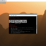
phpBB forum beta test: round two
Many thanks to everyone who provided feedback on the previous round of phpBB beta testing. I’ve fixed most of the issues that were identified and applied Paul’s stylish new look and feel, so it’s time for another round of testing. As before, I’ve placed a snapshot of the current forum here; please have a play and report any issues you find under this post.
Major fixes:
- Imported topic authors now identified correctly.
- Imported posts are now searchable.
- ReCAPTCHA has been enabled for new users.
Current known issues:
- The top navigation bar is broken under Internet Explorer 8 and earlier.
- I haven’t filled in the board name or forum descriptions yet.
We’ll run with this for a day, and if nothing too serious is identified, we’ll replace the existing forums with this version. Permalinks to old forum posts and topics will continue to work correctly.


124 comments
Edek
Hmmm… The new phpBB forum looks great! I love the sleek interface and look. But the forum is a bit too overwhelming: it would help if the side bars and top would be slightly enlargened and the background would either not be entirely white or filled more with things.
TechJeeper
Honestly… as someone who has created and operated about a dozen forums of various categories, the recent phpBB security issues have driven me to convert my active ones to SMF as well as use SMF for all future projects. There are some nasty flaws in phpBB3 that I wasn’t a fan of… was there a reason for choosing phpBB3? SMF conversion was a breeze by the way. Just a thought!
Rick
SMF is in no way better than phpBB when it comes to flaws ;) As it stands, both phpBB and SMF suck, code wise…mainly because they are on ancient codebases that are poorly planned. Newer systems are so much easier to work with, but obviously lack some of the features you get with more established systems.
Personally, I’d have forked out the $140 for XenForo, it seems silly not to use the most stable, best designed forum system out there (IMO of course).
That being said, the new forums are a million times better than the crummy wordpress ones! Now all that needs to happen is wordpress being removed completely, and being replaced with something half useful, with the end result being something a bit like howtoforge.com but for RPI.
Alex Langer
Howtoforege btw is based on Drupal. Same I use for raspberrycenter.de. It’s a great OS CMS with a lot of community features (but forums suck here, too ;) ), widely used for all kinds of small and very big websites.
Unknown Bliss
phpBB 3 actually has never had a major security vulnerability. You can view the security record here – http://secunia.com/advisories/product/17998/
phpBB 3 has several strict requirements for code. All code is extensively reviewed and audited by developers before being added to the core, even if the code is by a developer. We have also had an external security audit done.
phpBB 2 did have a bad security record but steps have been taken to prevent this (QA, code review process, security audits) and recently since the 3.0.7-PL1 feed issue and the 3.0.8 flash issue even further steps have been taken. phpBB3 is an almost complete re-write of phpBB 2 and it was written with security in mind.
I’d like to point out that SMF (1) has a worse security record than phpBB yet it was out for a shorter time (I think). http://secunia.com/advisories/product/5285/?task=statistics 16 security issues compared to phpBB’s 5. SMF 2.0 has not been out for that long and has already got one security issue (http://secunia.com/advisories/46386/). Generally in large OS projects you’ll find security issues are less common than they used to be due to greater awareness and better review processes.
Unknown Bliss
phpBB Website Team Member
rew
The NUMBER of security issues is not a good metric for measuring the security of a product. One product may have had 16 issues of: you can cause the server to malloc way too much memorysh the server process (which gets restarted automatically), while the other had 5 of the “you get root if you do this” type…..
Unknown Bliss
If you look at the links provided you’ll see that phpBB has never had a major vulnerability, all of ours were minor. SMF however has.
psergiu
Excelent ! All the large image formatting issues from the first test are gone !
Good Job !!!
bzip
I still cant log in !
bgreat
I initially was unable to logon from my Motorola Xoom with ICS. I was successful once I tapped the login button instead of using Enter on keyboard after typing password. Appears to be an issue with form posting.
Michael
Good work, and Paul’s style looks great.
A couple of minor points:
* Would it be possible to migrate the profiles data – particularly user location, profile picture and signature from simple:press ?
* Can the number of links in a signature and the total number of characters in a signature be raised from the current limits of 5 links and 255 characters as my simple:press signature doesn’t fit in phpBB with the defaults. This can be changed in ACP->Signature Settings–>General Settings. 10 links and 512 characters would be sufficient.
* Could the MOD Unknown Bliss recommended be installed? – you can find it at http://www.phpbb.com/community/viewtopic.php?f=70&t=2146633 which adds functionality for social networking buttons (next to PM, Jabber, WLM etc).
scep
The problem with big sigs for mods is, IIRC, phpBB isn’t granular enough to change size/link number per user group. Everyone will get this.
Whilst we are on the subject, can you please turn off sigs in the new user group permissions. And install the Q&A sign up mod. And please please please – no images in sigs! Oh – and the moon on a stick. Ta :)
bonelifer
Q&A is a builtin option for Captcha and is currently the only recommended captcha.
bonelifer
phpBB.com Moderator Team Member
scep
Thanks!
zag
Agreed, Recapatcha has been cracked and you will get lots of spam.
Q&A is the only one that is reliable for PHPBB3
5 Questions is uncrackable currently by the spam bots.
Also do the UTC patch and that will stop a lot of attacks before they even start ;)
http://www.phpbb.com/community/viewtopic.php?f=46&t=2122696
Hans Harder
The picture view is horrible.
see : http://www.raspberrypi.org/phpBB3/viewtopic.php?f=9&t=2398&p=68807#p68807
if you use the link of the picture directly, you see it in the correct proportions…
Otherwise it seems pretty good.
guru
Thanks. Will fix that. Looks nasty :-)
liz
Thanks Paul! (Points up – that’s Paul, everybody. He doesn’t really look like Alfred Hitchcock.)
mahjongg
I assume that this:
http://www.raspberrypi.org/phpBB3/viewtopic.php?f=2&t=5559
is the same issue?
Very stretched out PI indeed!
Luckily if you do an “open in another screen” (on safari) of the picture you get a picture of normal proportions.
liz
Looks that way – thanks for the spot. Very helpful.
Hans Harder
Thx Paul !
Otherwise it would look like a new version of the RPi which is also as thin as a credit card :)
spurious
One request. I find the red font gives me a headache. Can we have toned down style available too?
paaland
I totally agree. The “new” look is very disturbing to look at. I visit the forum daily and search for new information. The new look alone is making me look elsewhere for my raspi info.
liz
Boy, you guys don’t like change, do you?
paaland
Sure I like changes. But only when I feel the change is for the better. But phpBB3 has the ability to let users choose theme if you enable it. That way users that can’t stand the new bright and red colors can still have their dark-ages feel.
DuncanK
Yes – please let users customize colours – remember those of us who have difficulty distinguishing or reading specific colours! While not important to the wider audience, it can make things really difficult for those affected.
liz
I should add to Eben’s post above that the new forum style should offer some clues as to what the rest of the website will look like when we integrate the changes that are coming there, too. O happy day!
Andy
Viewing the forum on my mobile device (Iphone4) is awful. Everything is oversized, it’s just about readable in portrait mode but trying to view in landscape mode is impossible, the txt is huge and it’s not resizable. WordPress and beta 1 are fine, not sure what got broken for viewing via a mobile device
texy
Agreed – unuseable on my iphone 4.
Texy
KeithSloan
Don’t like the latest forum, especially the white back ground
liz
There are many scripts available which will allow you to invert the colours on your monitor if white makes you sad.
mahjongg
Well perhaps KeithSloan is a Goth, you never know!
Black might sheer her/him up, I know that blues music has that effect on me, it strange that “sad” music can lift you out of a depression, but so it is.
KeithSloan
No I am not a goth!!! Heaven forbid. I would prefer a light grey or blue background. White is too bright for my old eyes.
mahjongg
Err. sorry, no offense intended!
Actually, I also do not like the “endless white space”. Too much of anything is bad I suppose.
Dave
I agree, the design presumes your looking at the page at full screen HD resolution. Too much white space and, well, red on white? Really? Looks like programmer art to me! ; )
Here’s what I call a good example of a compact, functional and easy on the eye forum:
http://www.kvraudio.com/forum/
Jim Manley
Scripts for mobile devices, e.g., iOS, Android, etc.?
KeithSloan
No I don’t want to invert the colours on my Monitor!!! Yuk what a horrible thought. Just would prefer that this forum had a light blue or light grey background. Do not see what is wrong with the default PHPBB layout or colouring.
AFineTapestry
Really simple thing: the page title currently says yourdomain.com – Index page
But you probably already knew that.
liz
Yeah, we know. That and the “my first forum” or whatever it currently says under the General Discussion forum and other similar bits will be gone before it goes live.
digital_addict
One small point that could be added to the end of the list. The pre-supplied smilles just don’t seem to sit correctly. See my post in Thermal Tape, the smilly is stuck in the air.
liz
Good spot – they seem to have been working OK before. We’ll look into it, but if we can’t fix it by tomorrow I don’t think it’s a bad enough bug to stop us rolling the new forums out.
mahjongg
Am I missing something, or are there really no avatars displayed next to the names of the poster? I don’t see any avatars at all.
liz
*Blinks*
That is an EXCELLENT point. Looking into it now.
jbeale
Is there a way to reformat the search results to be more efficient with screen space? I have a reasonable sized desktop screen (1680×1050 pixels) but I only see 2 or 3 results per page, requiring a lot of scrolling. Most of it is just blank empty space between lines. I think “Author, Time/Date, Forum, Topic, Replies, Views,” info could all fit on one line (if that is all really necessary in a search result…) Right now it takes up six separate lines.
greg
The forum section headers are HUGE, they stand out more than anything else on the site, use much space and actually distract a lot… please make them smaller.
digital_addict
Just one more. There is no difference between admin, moderator and member. Everyone is red and no title.
bonelifer
Yes it would be nice to have the usernames colored via their usergroup color.
scep
Mods and admins haven’t been allocated yet. It is Eben all on his lonesome :)
Jim Manley
I used to have the ability to adjust the text size and the display flowed to fit within the display width in the original PHPBB beta. I don’t see any option for that now. At least I can zoom the page (please do NOT break that), but, that’s not a satisfactory alternative to text size control.
I know it’s all the rage to have lots of white space with tiny typefaces in publishing design these days, but, that’s coming from artistic types who design large magazine-sized format pages with style-oriented content on paper, not technical content on limited-sized screens, particularly mobile platforms. Please at least provide an option to turn off the foofy expansive white space views, and control over text size.
On an iPhone/iPad and Android phone, the top News/Forum/About… menu is stacked along the right edge of the display (although left justified), pushing the rest of the page below the bottom of the display, other than the Raspberry Pi logo and site title, which remained in the upper left on the Android screen (it’s on the left below the menu on the right on the iPhone/iPad).
Searching is only possible in either Raspberry Pi or Projects and Collaboration sections – can we get search across the entire site?
It appears we still need to pad search terms smaller than three characters with wildcards, and the limit in term length is 14 characters. Why not just auto-pad and auto-truncate too long/short terms?
Now I can search for USB without padding it, but, it’s too common a term! Make up your mind! ;) Seriously, at least return a limited number of results (easy to do in SQL), with the option to continue searching backward in time if one really needs to do that.
Search terms come up highlighted in light gray characters on a white background – can they instead by background highlighted in something like medium (not too light) yellow (the way manually-highlighted text would appear in print)? Even better would be user control over all text attributes. Not sure what scripts Liz is talking about for changing background colors, but, they won’t work on mobile devices, AFAIK.
I’m not sure how to test it, but, it appears that not all pertinent results are being returned based on some fairly unique search terms, my Pi-finity! game name, in particular. I soon figured out I can’t include the “-” or “!” in the search term for obvious reserved characters reasons, but, even so, I only received three results for a query for “finity”, and there should be many, many more.
URLs are showing up within raw HTML for anchor links (e.g. … and block quotes (e.g.,
Jim Manley
Rats, by embedding raw HTML, I messed up the formatting of my post – not sure how it interpreted an anchor link as italics, though!
Jim Manley
Oh, it interpreted the blockquote tag as … an actual blockquote! DOH :)
bonelifer
If I understand correctly they have reimported the Simple:Press db in order to fix certain thing that didn’t work correctly the first time(ie usernames showing up as guest when they weren’t made by a guest). With each import they would have to rerun the Search Index to reindex all posts. So I assume they will adjust the search parameters so that 3 letter terms won’t will be included and other things. Until the posts are re-indexed fully you’ll find a lot of things are searchable.
Darren
Wow it runs at lightspeed compared to the old one.
mahjongg
That could be just the result of many fewer users using it, but lets hope its not that.
Ray_GTI-R
Howdy (???????????????????????????????????).
What kind of message is that sending out.
(Period rather than question mark in both above instances as this is a rhetorical response.)
FWIW Yup, it’s fast here, pardner.
I’ll chek it out on my Padd l8tr.
Gordon
I really do like Twitter Bootstrap.
Ray_GTI-R
Me3
bonelifer
Could the line above posts in viewtopic be a bit darker(easier to see) so that it’s easier to see when one post ends and another begins.
bonelifer
There’s no search link on the main index of the forum, which is really inconvenient.
Kaleb
As someone who used to maintain a phpBB forum, it’s best to go with another solution, either MyBB or SMF.
Plus, the skin is too light and there’s no delineation between posts.
tbar
I’ve tried searching for the term ‘USB’ and got the following:
Information: The following words in your search query were ignored because they are too common words: usb.
You must specify at least one word to search for. Each word must consist of at least 3 characters and must not contain more than 14 characters excluding wildcards.
Please let 3-letter words be searchable!
Semtex
Alas I’m going to have a hard time with the new forum style. I know phpBB has many advantages compared to the current forum, but the style in the new forum is jarring. The text is too large there is far to much white space and it’s basically unusable on a mobile device. I usually use my iPhone to read your forum.
In way of contrast, have a look at http://www.tonymacx86.com/index.php. It also uses phpBB but the design has a clean, clear, appealing style… there is no excessive white space and it works beautifully on an iPhone.
Sorry to be a downer… but I mean this to be constructive feedback.
MyName
I guess that since you limit the width of the forum, the date/time information spans over three lines (red box). Problem I see is that every post’s line get’s unnecessary high. (green box)
I would try to optimize it as seen in the (blue box)…
Also, for us with a higher resolution of 1024*768, it’s quite annoying that the site doesn’t scale it’s width…
http://i.imgur.com/G3uge.png
forrrge
Could you add tapatalk functionality please, easy to add in and makes it very easy for iphone and android users to use the forum.
http://www.tapatalk.com/
Andy001
On Internet Explorer 8 the left hand side of the text is missing unless you maximise the width of the explorer window (text not spacing correctly within window). Please make this forum backwards compatible as IE 8 is still in use in schools and global companies.
rocket-dog
No. That is plain awful. Red on white? Too much white space. Default phpBB layout as per the original trial is much better.
Sorry.
killor
Hello,
only report a single incident.
If we put the google translator to work, (like me)
line “forum FAQ LOGIN REGISTER” is put into
the first line of screen leaving the logo below and is not seen the text “RASPBERRY PI”.
Nor is it anything serious happens if you can not fix.
thank you very much
PS: Watching from Chrome.
bgreat
Using Android ICS on a Motorola Xoom, the page layout has problems.
In portrait view, the top bar pushes the menu bar to the right of the screen in a single column, leaving a large empty area on the screen and forcing the page content down.
In landscape view, the top bar menu renders horizontally, but when the page portion is zoomed, the top bar renders incorrectly shifting to the right. When zoomed, the top bar can not be scrolled left to access menu choices.
Headline text is too large and the page gives an overall impression of too much white space. The apparent gap from post to post is almost as large as the post.
Though the layout is problematic, overall the performance improvements are a real plus.
guru
I’ll do some pukka work to make mobile/tablet more friendly. Thanks for the feedback.
pauldow
I’m using a HP Touchpad tablet, and unlike other tablet users, I find the category page OK, but the topic subject page titles are a bit small. Granted, I’m not on a very popular browser.
The font choices look good. I think darker lines between posts could satisfy the separation concerns. Higher contrast may help unless you go with red text on a green background. ;-)
Personally, I’m not a fan of the floating command menu. It acts like those annoying advertisements that are designed to distract me from the page content I came to see. When I scroll to a position I want, the menu then positions itself over the top line I wanted to see since it covers two message text lines. I then have to scroll again. The current WordPress one only covers one line.
dhead
I think it would look allot better if the topics titles and extra info (on the topic list on each forum) would be limited to one line (and not three as now).
If you can’t squeeze it to one line you should consider to reduce the extra info font to be much smaller size second line thus reducing the height of this line.
This would make the topic list more compact thus easier to navigate and to find information.
The same should be applied to the main page of the forum.
Part of this vertical spacing issue I find the new phpBB allot nicer than the old one,
I really like the clean white look.
Overall I love what you guys and gal’s doing,
Cheers from Israel !!!
SimonIOW
Tiny issuette; The post icons don’t seem to appear when selected?
simonIOW
Is it supposed to let you know if the post has been edited?
guru
I was hoping no-one would notice that :-)
simonIOW
Sorry, my bad.
Sleepy
Waiting for phpBB to run on my Raspi! ;-) :-)
JonB
Doesn’t render right for me. IE8 on XP. Looks far worse than the first beta (which was a phpBB out of the box format, clean and easy to navigate) – why change that?
JonB
Oh heck, it keeps redrawing the screen in odd ways. Lines keep disappearing and coming back – I cannot navigate it at all. It looks like a faulty monitor, but it’s the forum software that’s broken.
Also, colours are really nasty, and the layout has for too much whitespace, as has been noted above. I agree that the forum titles (when they display properly at all) are way too big. Please, please revert to the original beta scheme. Read and white are far too gaudy for text, there is not enough contrast for one thing – it’s bad for the eyes.
I think you can take the Raspberry analogy too far: stick to calming blues and leave the bright red for the logo.
JonB
Individual postings in a thread do not stand out; th thread looks like one big post.
JonB
Paragraphs in posts have too much whitespace between them – the gap is too big. It’s a bit like the WordPress forum if you leave a blank line between paragraphs when entering a post. The post ends up looking all spaced out.
tkp
Red on white is painful. Liked the layout the way it was before.
lel
While I appreciate all work done on the forum / new theme, I have to say that this design is simply ATROCIOUS.
MY EYES ARE STILL IN PAIN.
As already mentioned by people here: way to many white spaces (there is absolutely no need to have three rows per topic), red on while looks just bad. As a result, threads / posts list is visually melting into one unreadable mess. The thing is looking totally wrong on mobile devies as well.
I think you should use default phpBB theme (from the fist beta) and just tweak color scheme slightly.
jamieoliver22
My two cents – I feel that there should be more seperation between posts, as it is quite difficult as to where one post ends and another post starts. Also, I think it would be much better for readability if the usernames/profiles were on the left side of posts rather than on the right. And a light grey around the website would also be nice (much like it is now). But it is looking good, definately much better!
mole125
I’d have to reluctantly agree with the comments about distinguishing between posts and even between the header/footer and the posts.
The bigger feature that appears to be missing (or badly hidden) is RSS feed support. Having new posts appear direct in my mail reader makes it much more efficient to keep track of new messages and keep reading it while at work without having to constantly click the back button to get round pages of new messages at the end of threads.
mole125
Judging by this post http://www.jeremylindh.com/phpbb3-forum-rss-feeds/ and navigating to http://www.raspberrypi.org/phpBB3/feed.php it looks like it should just be a simple configuration option in the Admin Panel.
spudy12
Like the fact that there is a login option on the main page. One small suggestion, maybe after login it auto redirects you the page you were on? Just trivial I know, but save a small amount of hassle?
spudy12
also at the top it always says yourdomain.com no matter what page your on!
liz
Yes, we know, but thanks for the spot. That’ll change when it goes live.
simonIOW
[list] is working, [list=] isn’t.
I think I also need to agree with the comments about the post seperation, it’s just not defined enough.
guru
Will do something to make separation clearer. It’s a fair comment and has come up a lot now :-)
List should be easy enough to make work.
Unknown Bliss
You need to put something after the equals. For e.g.
[list=1] will give you a numbered list.
Unknown Bliss
phpBB Website Team Member
simonIOW
Hmmm
I tried [list=1] and it formated it as a list, but without the numbers.
Looks like a common issue amongst new phpBB posters :)
http://user.services.openoffice.org/en/forum/viewtopic.php?f=50&t=337
I’ve now RTFMd
http://area51.phpbb.com/phpBB/faq.php?mode=bbcode
added the [*] in front of each item and I think it now works…
Hmmm, need more documentation?
SN
General comment about the style – there is TOO much white space everywhere – everyone runs ‘shortscreen’ laptops these days (and I meant that – widescreen is a misnomer as no-ones screens are any wider or have more x pixels than before) which means you don’t get many rows of text (or posts) per screen full – therefore IMHO its imperative you reduced to a bare minimum the amount of white space between lines and between spaces and around the headers for the forum.
guru
I run almost exclusively on a small screen laptop, often with the webkit element inspector open, so I appreciate this. This is also the reason most input devices have a very accessible vertical scroll function.
I’m happy to reduce the inter-post spacing a little, and make the start of posts more distinctive, other than that, it’s staying roughly as is.
Future changes will include letting the width increase on wider monitors (but not too much as too wide a column for short text is hard to parse), and making the fixed top bar toggled, as I can understand a lot of people not wanting/liking it.
bonelifer
I’m using Windows 7 64bit. In IE 9 the viewtopic page renders correctly:
http://i7.photobucket.com/albums/y267/bonelifer/phpBB/ie-right-uhm.jpg
In Firefox 12 the mini profile info ends up below it’s post instead of to the right:
http://i7.photobucket.com/albums/y267/bonelifer/phpBB/firefox-wrong.jpg
bonelifer
That from this topic:
http://www.raspberrypi.org/phpBB3/viewtopic.php?f=2&t=5589
Unknown Bliss
You’ve done a really nice job with the forum, especially with the style. Well done.
Unknown Bliss
phpBB Website Team Member
guru
Thanks, hopefully it’ll only get better :-) Once the dust has settled, I’d love to do a proper bootstrap/phpBB theme for the community. I might have to do some careful work to avoid GPLv2/Apache2 license issues.
Neil MacLeod
Sorry to be negative, but why is the forum sooo white? It’s just a wall of text with occasional red headings. There is very little to visually denote the end of one post, and the start of the next – they literally run into each other. A well designed forum style will “block” off the heading of each new post so you can quickly scroll through and instantly know where each post begins and ends. You simply can’t do that with this beta2 forum – it’s horrible, and a major pain to try and read.
Please please please reconsider this style by adding blocks of contrasting colour (darker, eg. grey) and rules (horizontal lines) that could be used to “box” each post.
Neil MacLeod
The top navigation bar is also “broken” in Webkit mobile browsers – instead of it wrapping or being sized appropriately, you get large text at the top of the page as follows:
”
News
Forum
About
FAQ
Download
Quick Start
Wiki
™ Info
”
followed by the rest of the site that in most respects (other than the poor colour choice and lack of contrasting blocks/vertical rules/horizontal rules) seems to work well on a mobile device, although the thread title when reading a thread is massive.
DuncanK
Generally I like the new forum, but it seems to be missing something. I can’t find the RSS All feed button – this is the feature I use most on the current forum since it’s one stop shopping for all new content!
Bakul
Some Feedback:
1. Too much white space. Translates to lots more scrolling on a small screen. More generally, screen “real estate” is valuable and a more compact layout can convey more information! Background color can be used to separate elements.
2. Understated, pastel colors are far easier on eyes. Ideally color should convey extra information.
3. Search does not seem to work. There is no search button for searching through all the forums — some posts can go in multiple categories.
4. Due to much whitespace using this on an iphone is painful. It would be neat if there was a way to use the `desktop’ view of the site (just like what some newspapers do that default to the mobile view if you connect from a mobile device). On devices like iphone/android you can zoom out and in to your area of interest so a desktop version of a site is better — the same thing will be true with the Raspi when someone interfaces a touchscreen! The button to switch to a desktop view should be at the top, not the bottom.
Thanks
fos
Personally, I think the them and the glaring RED color that dominates is terrible. A commercial forum like Invision Power Board or XenForo would be more secure and have better support. Version 4.x of vbulletin has been nothing bot problems.
Just my 2 cents worth.
jamieoliver22
I see that it has been updated slightly, and it is starting to look better and more organised. I agree with what others are saying that the post links shouldn’t take up three rows, and would be much better if the layout was more compact. Keep up the good work!
Daniel Ferreira
The new forum looks nice but, as others have said, the color scheme could be tweaked a bit. A little more contrast would greatly improve readability and make it less tiresome to the eyes.
N
the phpbb copyright is no where to be seen?
bonelifer
While we’d appreciate it if site owners included the visible copyright line in the footer, we no longer require it for support at phpBB.com.
phpBB.com Moderator Team Member
guru
That was my impression of the license. I wasn’t aware of the support issue though, so thanks for that info bonelifer.
I don’t think there’s any reason that there won’t be a clear attribution and link in the footer at the top of the credits. I like to say where all the bits and pieces come from, so people can use them to go and do their own thing if they like.
It’ll be the last thing to go in before going live. Fixing all the bits I’ve missed in the overhaul comes first :-)
N
Cool, I just found it slightly ironic that such a project didnt give credit back to phpBB, and wanted to highlight it incase.
LastSilmaril
OK great, I was wondering why there seemed to be two different forums going on. I’m assuming our current handles/data will transfer too?
guru
Posts and accounts will move over. PMs and other ephemeral data may not make it, so back them up if you can.
kev
the banner at the top takes up 1/3 of the page on my nokia n95
simonIOW
Need any more help with testing on the new forum? I keep popping onto the new forum but the test posts have vanished so don’t want to add any more unless I break some syncing :)
simonIOW
“in case” even… Gah, comments should have a preview…
bonelifer
Needs to have “Mark forums read” on the index. Should be fine in the footer.
guru
Thanks again for the input bonelifer. Nice to have the glaring omissions pointed out by someone who knows the system well.
rew
It’s been a few days already since: “We’ll move the forums tomorrow”. When is the move going to happen? What is holding you back?
liz
We’ve been implementing some graphical and interface changes you guys requested.
simonIOW
That looks better!
Nav works in IE8 now.
Grey/Black text is much easier on the eye.
Smilies in line
Feels much more solid!
Thumbs up here.
liz
And this is precisely why we tested it before going live! We’re hoping to press the button over the weekend, as long as we don’t spot anything else.
simonIOW
I try and explain about testing at work… The number of comments about “how do I test?” I hear from users.
My motto is always that I’d rather the user breaks it now, than after it goes live!
bonelifer
Since there haven’t been a lot of posts lately wasn’t able to tell if it’s there in the style, but really should have the “First unread post” in the viewtopic body at the top.
SN
you going for round 3 right now or going all the way, its all gone a bit weird….?
free beats
just in case any of you need free beats or know someone who wants to be
a singer or rapper, but is on a budget, check out demoxpress.
net they have a free membership option and you can download over 70 beats for free, no credit card needed to
sign up, just sign up and download beats.
Comments are closed